This project was created using Power BI. In this project, I used various tools such as Dashboards – Data visualization, Extract, Transform, and Load (ETL), Measures, Data modeling, Data cleaning.
Title:
Sales orders
Project Overview:
Summery:
To do this project, I used the Northwind database, which contains sales data for many years of the fictional enterprise “Northwind Traders,”. I extracted the data from the Kaggle site. In fact, this fictional enterprise is involved in global food import and export. The existing database has several files in CSV format and includes elements such as customers, orders, inventory, purchases, suppliers, shippers, employees. By using the data of this fictional enterprise, I reached achievements that can be useful for any real company to get an overview of the state of their company. Obviously, larger or smaller companies are always involved in ordering, buying, selling, and shipping similar to this company. All reputable companies need proper planning to calculate the following:
Receiving product orders, timely delivery to the customer, estimation of the amount and average sales, delay in the shipment and the percentage of shipment not shipped.
Using Power BI software allows us to use data modeling and data visualization to analyze the company’s situation at any moment and predict a picture of the future.
Database:
Database contains the entities below:
There are 6 CSV files whose fields and records are as follows:
Customers: Customers who buy products from Northwin:
9 fields & 91 records
Company name, Contact name, Contact title, City, Region, Postal code, Country, Phone, Fax.
Orders: Sales Order transactions taking place between the customers & the company:
14 fields & 830 records
Order id, Customer id, Employee id, Order date, Required date, Shipped date, Ship via, Freight, Ship name, Ship city, Ship region, Ship postal code, Ship country, Shipper id
Order_Details: Sales Order transactions taking place between the customers & the company
5 fields & 2155 records
Order id, Product id, Unit price, Quantity, Discount.
Products: Product information
10 fields & 77 records
Product id, Product name, Supplier id, Category id, Quantity per unit, Unit price, Unit linstock, Unit son order, Reorder level, Discontinued.
Shippers: The details of the shippers who ship the products from the traders to the end-customers:
3 fields & 7 records
Shipperid, Companyname, Phone
Suppliers: Suppliers information and vendors of Northwind:
12 fields & 29 records
Supplied, Company name, Contact name, Contact title, Address, City, Region, Postal code, Country, Phone, Fax, Homepage.
Questions & Goals:
- What is the percentage of sales orders that have not been shipped?
- How many days has the company delayed in shipping orders?
- What is the maximum amount of sales for different orderids?
- What is the average sales amount?
- What is the sales volume of distinct products by customers’s country?
- How can the quantity of sold products be checked dynamically along with the changes of other items?
- What is the total freight per sales order?
- What is the total amount of sales based on the company name?
- What is the total amount of discounts for each supplier?
- What is the amount of sales based on the country?
- What is the total amount of sales?
Steps:
I designed a sales analysis dashboard using the data of an fictional enterprise, and by using DAX expressions in Power BI software, I was able to merge several tables in CSV format in Excel. And finally, I designed a new model of the company’s sales and shipping orders and presented the company’s dynamic analytical dashboard with data visualization. In the first step, I performed data cleaning using ETL in the power query section, and then I designed a model for the data in the View Model section.
Data Cleaning:
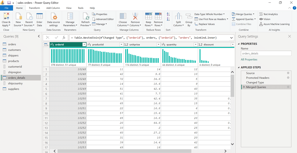
Customer id, Shipcountry, Shipregion: To create a relationship between the tables, I had to make the fields unique. So, in the power query section, I first duplicated the required fields and then made them unique.
Orders: In the next step, there were two orders tables that I merged.
Customers: The naming of the headers of this table was changed to “Column” in the loading process, which was modified using the CSV source file.
Shippeddate: This field contained the shipping dates of the goods, which were stored in the format of day, month, year, and hour. While the orderdate and requiredate fields were saved without recording the time. In order to unify the format of these, I used “Split”, “Remove duplicate” and “Duplicate column” tools.
Finally, I saved the changes and arranged the tables ready for model design.
Data Modeling:
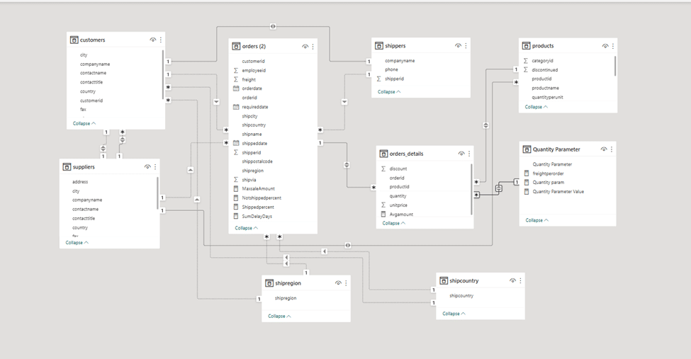
I designed a model in the “Model View” environment using the “Snow flake Schema model”. In this model, if the orders table is considered as a “Fact”, the rest of the tables are located around it as a “Dimension”.
Actually, the fact table or orders works as a query with which all the common fields of the dimensions have a single or both relationship. This type of model avoids redundancy.
The way to connect the dimensions is as follows:
Company name (Shippers, Customers)
Customer id (Orders , Customers)
Phone (Customers, Supplier )
Shipper id (Orders, Shippers)
Country (Customers, Ship country)
Order id (Orders, Order-details)
Region ( Customers, Ship region)
Ship country( Orders, Ship country)
City( Customers , Orders , Suppliers)
Product id (Product, Order-details)
Ship region ( Orders, Ship region)
Supplier id( Product, Supplier)
Quantity (Order-detail , Quantity parameter)
Analysis:
After preparing the data and data modeling, in order to reach the answers to the desired questions and goals, I have to write the required measures using DAX.
-In order to get the maximum sales amount, I first chose the name of the “sales amount” and calculated it based on the “quantity” and “unit price”. Then I created a measure.
-To get the percentage of undelivered commodity, I created a measure based on total freight and shipping date. Based on this, the percentage of commodity delivered was obtained by subtracting the number 1 from the percentage of commodity undelivered, which was calculated in another measure.
-I created another measure called “SumDelayDay”, which calculates the number of days that the goods were sent late. This item was created based on “requireddate” and “shippeddate” fields.
-To calculate the average sales, I used the name “Avgamount” and created a measure based on the quantity and unit price.
-To display the number of products that have sold the most and are known as distinctive products, I created a table that I used from the “Productid” field and named it “Disp”.
-To calculate the freight based on the number of orders, I created a counter called Freightperorder. This formula first calculates the total freight and then divides it by the number of orders.
-I defined a parameter called Quantity parameter, which by changing it between 0 and 100 quantity percentage of goods, changes in the average amount of sales are displayed. This parameter dynamically affects other charts.
Finally, the project was prepared for analysis and data visualization.
Dashboards:
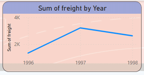
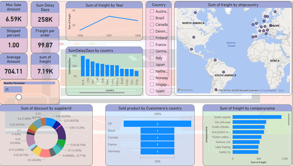
Using a line chart, the company’s total freight are displayed in the period of 1998-1996. As the diagram shows; Total sales grow from 1996 to 1997 and reach their highest level in 1997. After that, there is a downward slope, which should be investigated, what was the reason for the decrease in freight in 1998.
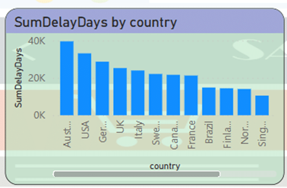
In the Clustered Column Chart, we want to display the number of days of delay in sending the goods. The graph shown based on the countries receiving the goods and in descending order shows that the highest amount of delay is related to Australia, followed by the USA.
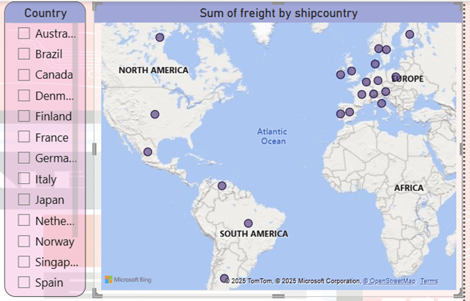
Using the map tool, I displayed the total sales in different continents. The continent of Europe has the highest density in the sale of goods. Also, sporadically in North and South America, we can see a lower sales amount. Using the country name slicer is very efficient to accurately display countries’ sales.
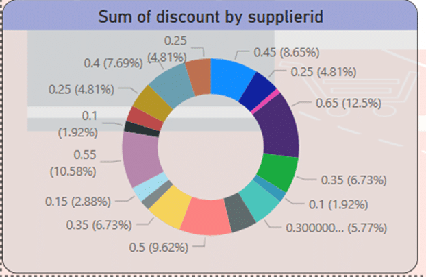
Using the donut chart, I displayed the total discounts with the details of the suppliers. These discounts can be seen from about one percent to over 12 percent.
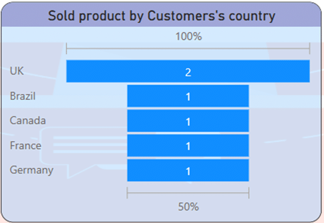
If we want to show the distinctive products that have the highest percentage of sales in the countries of the customers, the funnel chart can easily do this. As it is known, 100% of product number 2 has been sold in UK and 50% of product number 1 has been sold in Brazil, Canada, France and Germany. In this way, you can plan for new products based on their request.
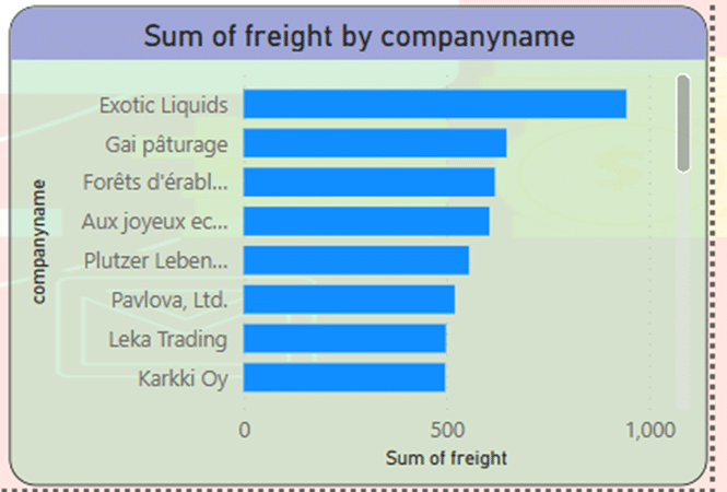
Since the company has agencies in different countries. You can check the amount of sales based on the name of the dealers. Using the clustered bar chart, you can get the largest amount of sales related to “Exotic liquids” company.
The change of the created parameter shows the percentage of sold goods, which can be used to see the changes of other charts.
Also, several KPIs have been designed that show the following results:
- In this dashboard, it is assumed that 25% of goods will be sold in the period of 1998-1996.
- The maximum amount of sales in a three-year period is equal to 6.59K.
- The number of days of delay in sending goods around the world in a three-year period is 258K.
- 100% of the ordered goods have been shipped.
- The ratio of total sales to the number of orders is 99.87.
- The average sales of products is equal to 704.11.
- Total freight is equal to 7.19.
Key points:
- In this analysis, Snowflake Schema model is used to establish the relationship between dimensions.
- It is possible to check 100% of the number of sold products in the dynamic dashboard.
- The highest amount of sales happened in 1997 and after that we see a downward slope in sales, the reasons for which should be investigated.
- The most recent delay in sending goods has happened in Australia.
- The continent of Europe has the highest density in the sale of goods.
- The discount percentage in the sale of goods is estimated from about 1% to 12% by different suppliers.
- 100% of product number 2 has been sold in UK and 50% of product number 1 has been sold in Brazil, Canada, France and Germany.
- The largest amount of sales related to “Exotic liquids” company.
- In this dashboard, it is assumed that 25% of goods will be sold in the period of 1998-1996.
- The maximum amount of sales in a three-year period is equal to 6.59K.
- The number of days of delay in sending goods around the world in a three-year period is 258K.
- 100% of the ordered goods have been shipped.
- The ratio of total sales to the number of orders is 99.87.
- The average sales of products is equal to 704.11.
- Total freight is equal to 7.19.
Results & Recommendations:
- The state of the company from 1996 to 1997 has economic growth and prosperity. The slope of sales is upward, but between 1997 and 1998, the slope suddenly becomes downward. The reasons for that should be investigated. It is suggested to focus on customer satisfaction, product quality, price, and delivery method.
- The amount of production and sales seems to be excellent. But the trend of sales growth is negative. The amount of sales should be checked over time.
- Regarding the delay in sending products to different countries, especially Australia, it should be reconsidered. Means of transportation, equipment for receiving and sending orders, the number of workers must be managed.
- It seems that the biggest weakness of the company is the delay in sending the goods, which should be seriously addressed, maybe this is the reason for the downward slope in sales.
- The amount of sales in Europe is good, but it seems low in other places. Advertising of goods and products should be planned and promoted according to the needs of each country.
- The percentage of discounts is low. It should be agreed with the suppliers during meetings to consider more discounts, for this purpose holding events can be effective.
- It is necessary to increase the functionality and production of differentiated products.
- Companies with high performance should be encouraged and their performance should be set as a model.
Action
In this project, In this project, I use simple functions, operators, and clauses to get my answers:
Aggregate Functions: SUM, COUNT, SUMX, MAXX,
Clauses: SUMMARIZE, CALCUATE, ISBLANK, TRUE, DATEDIFF, DAY, AVERAGEX, DISTINCTCOUNT, FILTER, SELECTEDVALUE, GENERATEDSERIES.
Query options: Duplicate Column, Change type, Merge queries, Rename Column, Remove Duplicate, Split.
Link:
Thank you so much for reading my project. I will be happy to receive your feedback and opinion about the project. If this project is useful for you, click on this link:
Link to project repository on GitHub
Link to project repository on LinkedIn
Link of CSV Northwind Database on Kaggle
